14 Afrocentric Color Palette Ideas for Every Room in Your Home

Most color advice tells you to pick “warm neutrals” and call it a day, and then your rooms end up looking like every other rental on the block. That’s the real problem.
A good Afrocentric color palette isn’t about following a trend board, it’s about pulling from colors that already carry meaning, kente gold, deep indigo, clay red, and letting them show up in a way that fits how you actually live.
This list walks through Afrocentric color palette ideas for the home room by room, because a palette that works in a bedroom will fall flat in a kitchen.
Some of these lean bold, some lean soft, and a few are built for small spaces where you can’t afford to guess wrong.
You’ll find a quick reference for each room, so you can see the colors before you commit to paint samples. Grab the ones that fit your space first, then come back for the rest.
1. A Living Room Palette Built on Kente Gold, Terracotta, and Forest Green
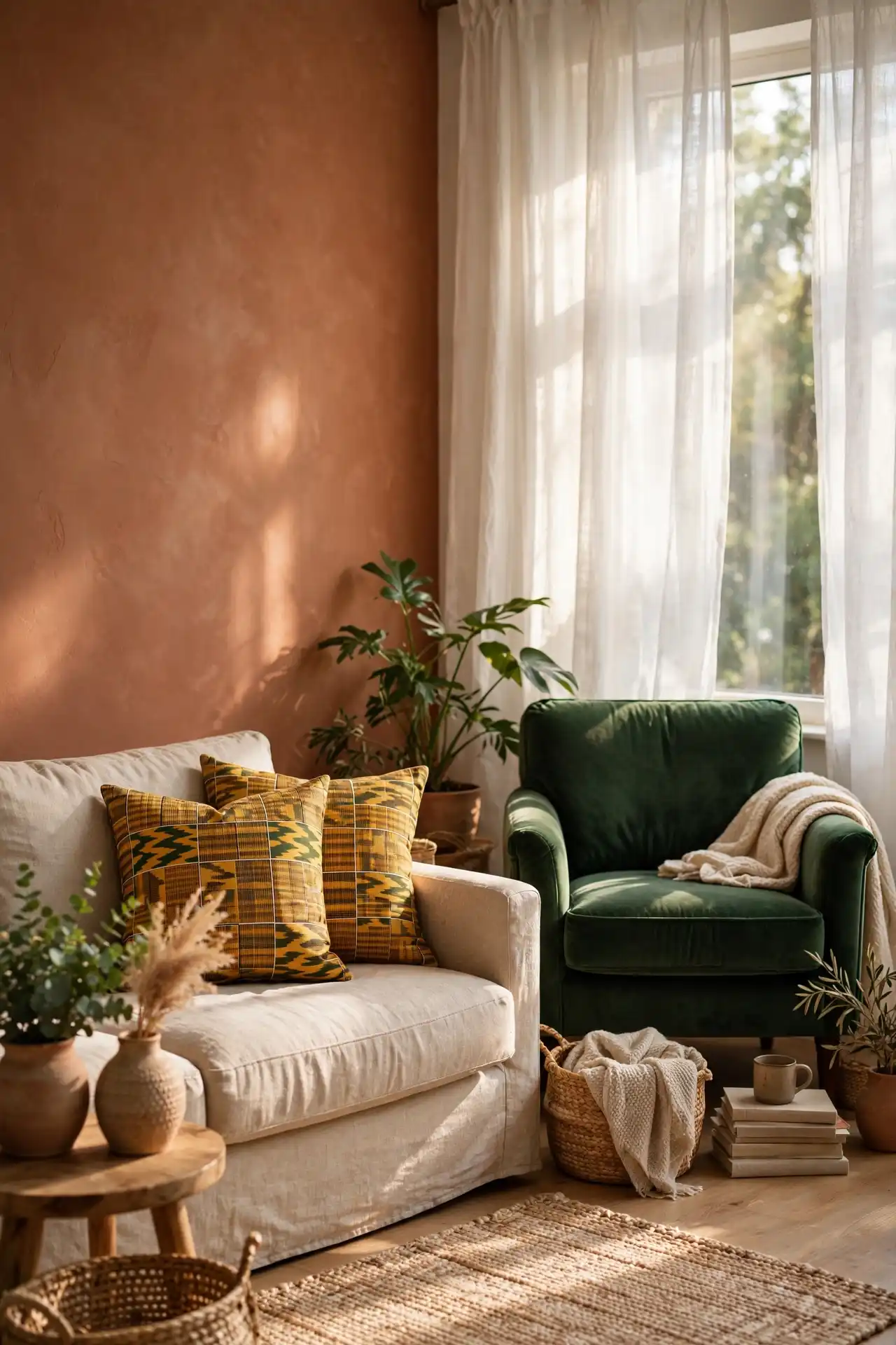
Most living rooms default to gray because gray feels safe, but safe also means forgettable after a while.
A stronger move is anchoring the room in terracotta walls, then layering kente gold throw pillows and a forest green accent chair on top.
The green keeps the warmth from feeling overwhelming, and the gold catches light in a way flat neutrals never manage to do.
Start with one large piece, a rug or a sofa, in terracotta first. Add gold in small doses through pillows or a lamp.
Let the green settle into the room before you commit to a full chair or a bigger piece.
💡 Quick Tip
Test kente gold on a small object first, a vase or a lamp base, before you buy pillows. Gold shifts warmer or cooler depending on your room’s natural light.
2. A Bedroom Palette That Leans on Deep Indigo and Warm Ochre for Rest
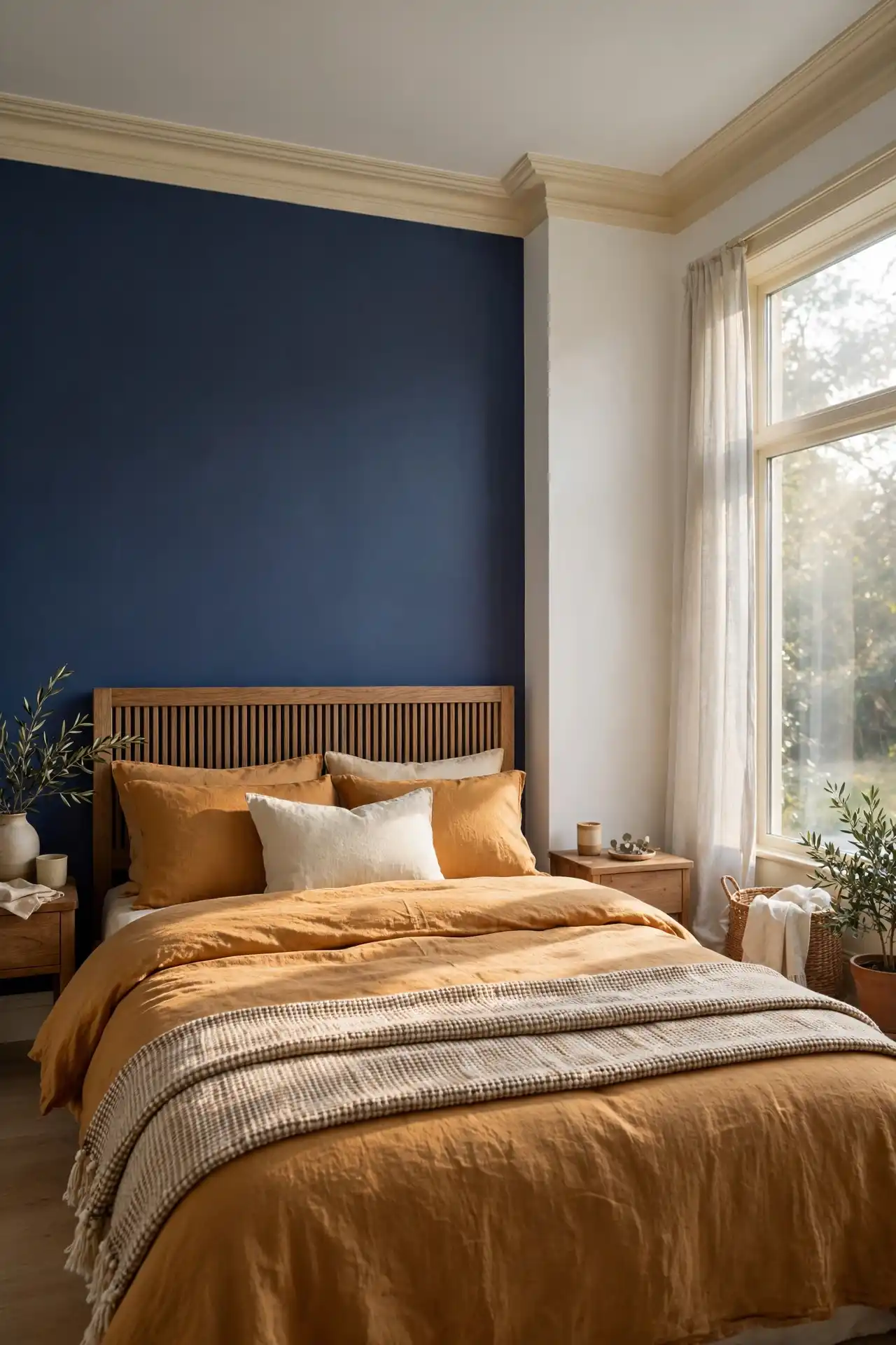
A bedroom needs a different job than a living room, since it has to help you slow down instead of performing for guests.
Deep indigo walls paired with warm ochre bedding do exactly that, without going as dark and moody as navy alone tends to feel.
The combination reads calm rather than cold, which matters more here than anywhere else in the house.
Keep the ceiling and trim in a soft cream so the indigo doesn’t close the room in on itself.
Ochre works better in fabric than in paint, since large ochre walls can shift more yellow than you expect once the sun hits them.
3. A Kitchen Palette That Pairs Clay Red with Mustard and Cream
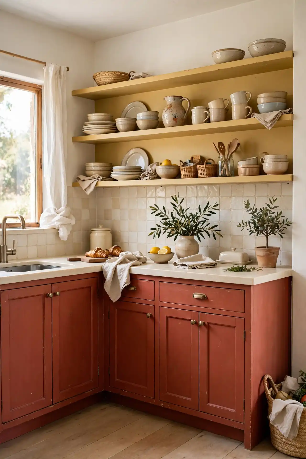
Kitchens get repainted less often than any other room in the house, so the palette has to earn its keep for years, not just a season.
Clay red on lower cabinets, mustard worked into a backsplash or open shelving, and cream countertops give you a combination that still feels grounded five years from now, long after trendier pairings have gone stale.
Paint or reface lower cabinets in clay red first, since it’s the largest commitment.
Add mustard through tile, open shelves, or a runner rug near the sink.
Keep countertops and upper walls in cream so the two bold tones don’t compete.
4. A Home Office Palette Built for Focus with Burnt Orange and Charcoal
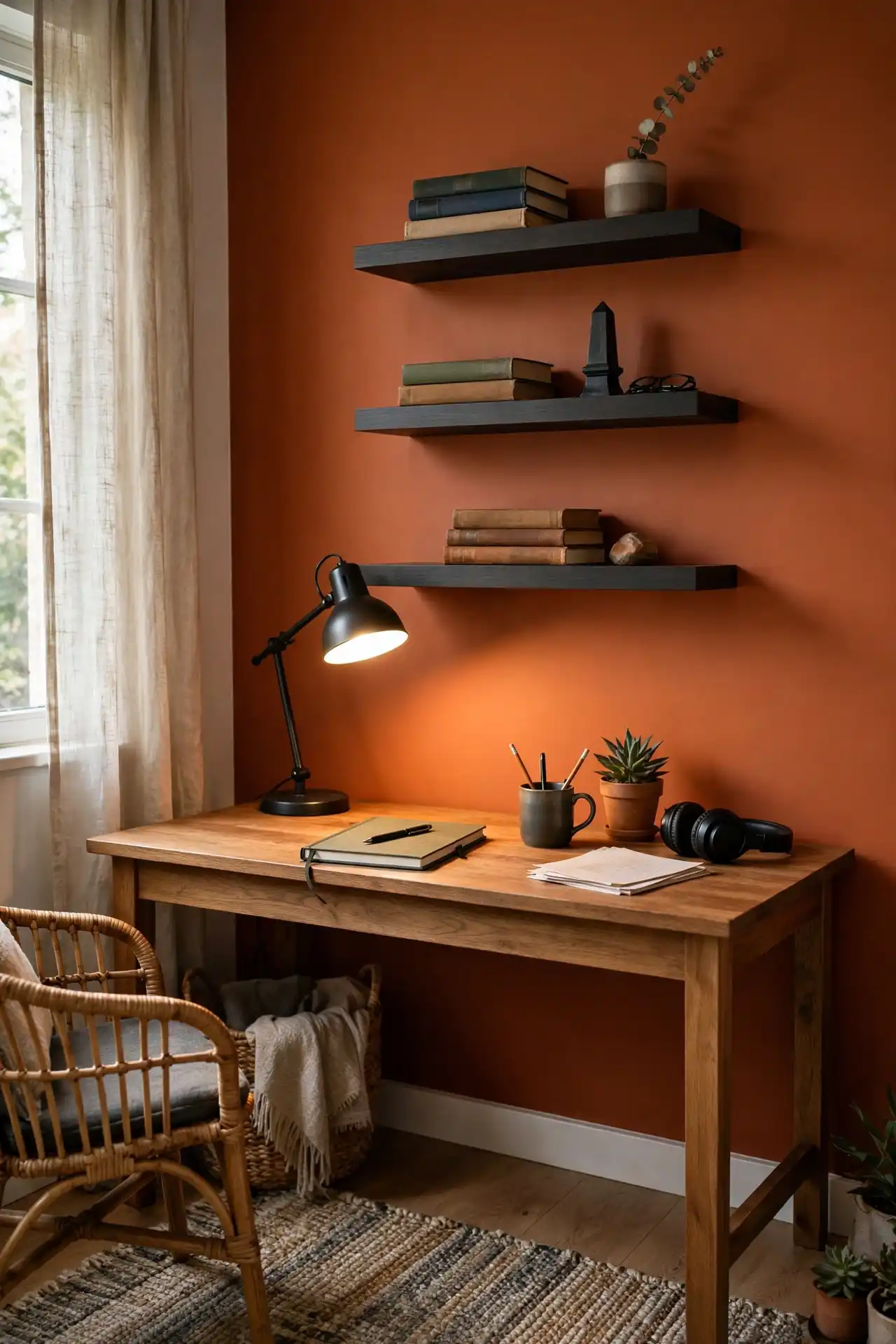
An office painted the same soft gray as everywhere else in the house does nothing to signal that work happens there.
Burnt orange on one wall behind your desk, paired with charcoal shelving nearby, creates enough contrast to keep you alert without turning the room into a showroom you dread sitting in for eight hours.
The mistake most people make is treating an office like a living room and softening everything into beige.
A workspace benefits from sharper contrast, not less, so resist the urge to tone it down too early.
Paint one accent wall burnt orange behind the desk.
Use charcoal shelving to ground the room.
Softening the whole room into beige and gray.
Adding orange in more than one spot at first.
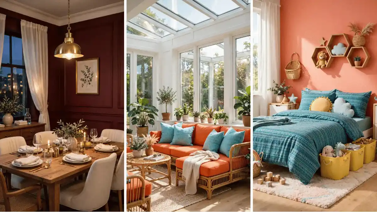
5. A Dining Room Palette That Uses Burgundy and Gold for Gathering
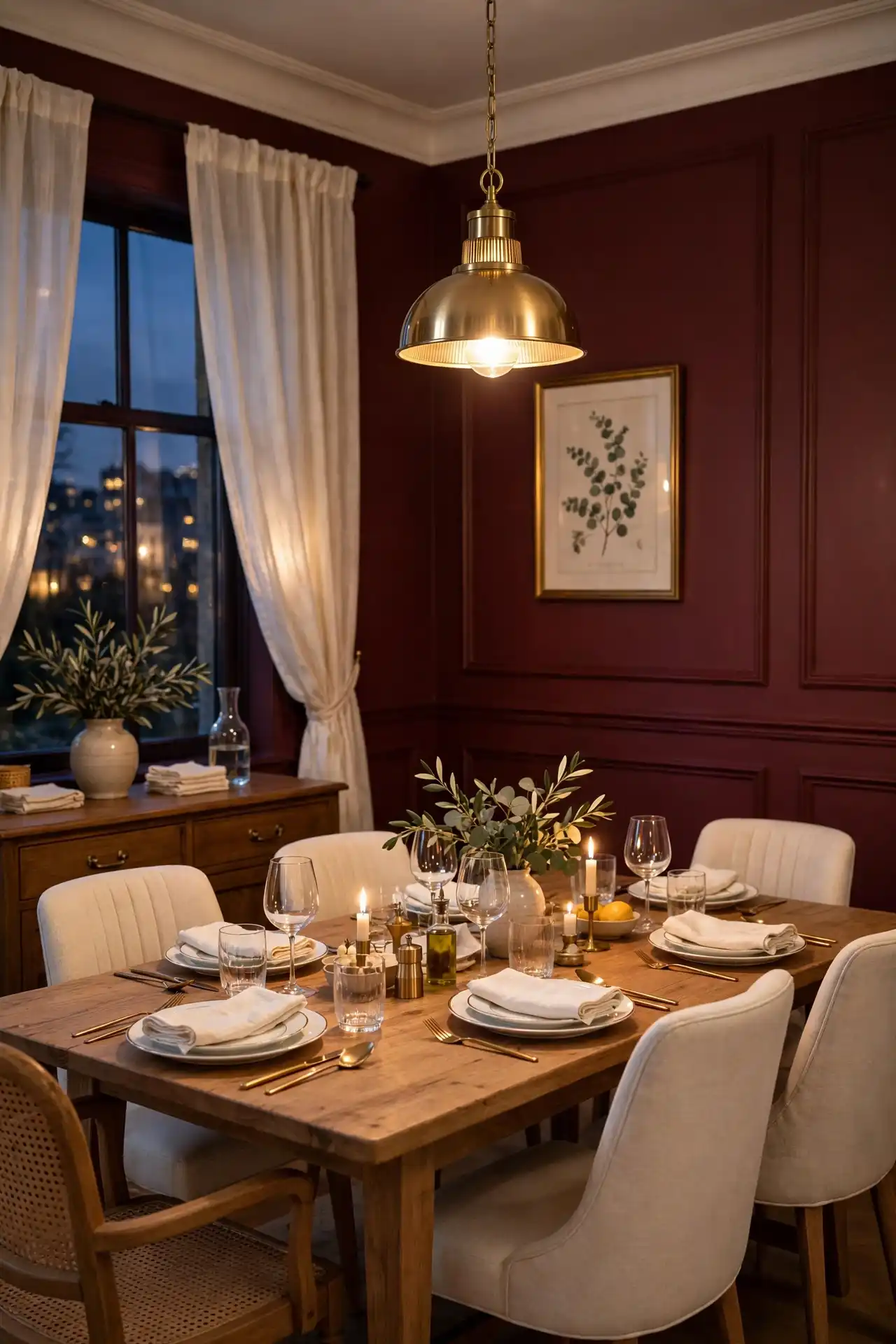
Dining rooms only get used a few hours a week in most homes, which means the palette can afford to be dramatic in a way other rooms can’t.
Burgundy walls paired with gold light fixtures and flatware turn an ordinary dinner into something that feels intentional, even on a random Tuesday when nothing else about the day felt special.
Before you paint, gather these three things so the room comes together at once instead of piece by piece over months:
What to grab first
6. An Entryway Palette That Says Welcome with Terracotta and Cream
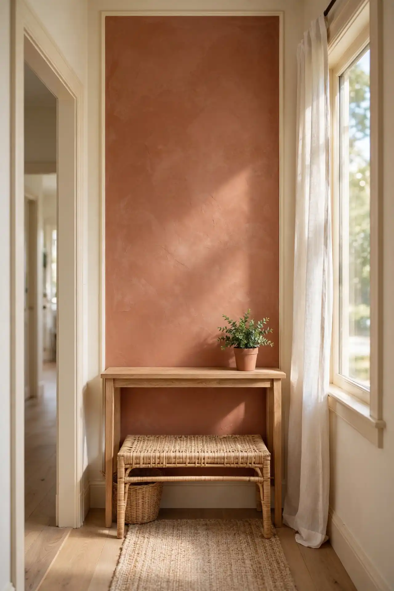
The entryway sets the tone before anyone even steps past the doormat, yet most people leave it as an afterthought, the same white as the hallway with nothing to make it feel considered.
Terracotta on a single accent wall, paired with cream trim and a woven bench, changes that instantly.
It gives guests something warm to walk into rather than a blank transition space between the front door and the rest of the house.
This works especially well in smaller entryways where a full room makeover isn’t practical.
You don’t need much square footage to make an impression, just one wall and a few honest textures.
Add a console table in a natural wood tone to bridge the two colors. Keep artwork simple here, since the wall itself is already doing the work.
A single terracotta wall does more for an entryway than a full room repaint ever could.
7. A Bathroom Palette Built on Sea Glass Green and Copper
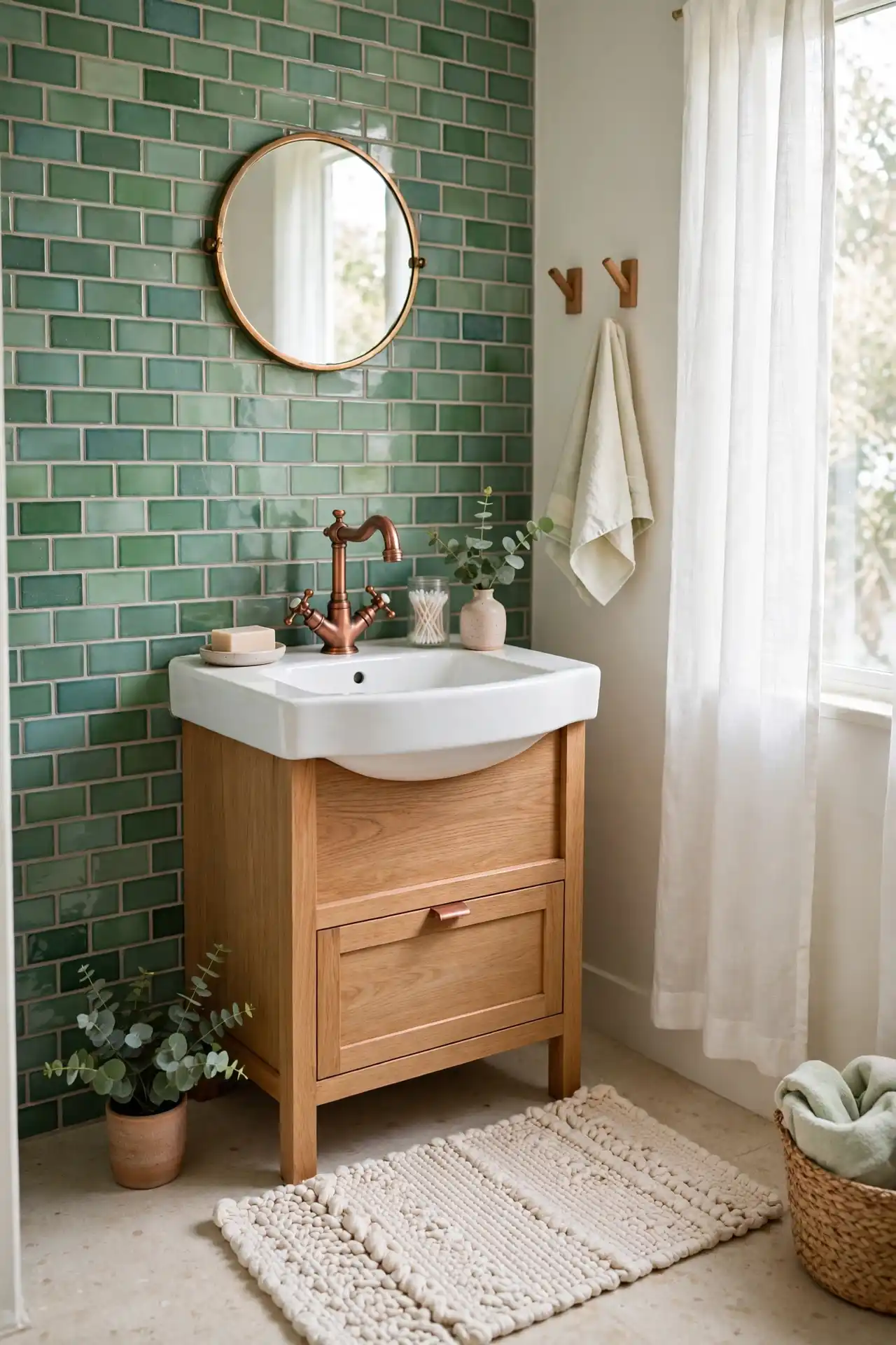
Bathrooms tend to get stuck in a loop of white tile and chrome fixtures because that’s what feels “safe” for resale, but a small room is actually the easiest place to take a real color risk.
Sea glass green on the walls, paired with copper fixtures and a woven cotton bath mat, turns a purely functional room into one that feels considered every time you walk in.
The trick is scale. Copper works best in smaller doses here than it would in a kitchen, think faucet, drawer pulls, a mirror frame, rather than covering large surfaces.
Sea glass green stays light enough that it won’t feel like it’s shrinking the room, which matters most in bathrooms without much natural light to begin with.
| Sea Glass Green | Copper |
|---|---|
| Best on walls or larger tile. | Best on fixtures and small hardware. |
| Keeps the room feeling open. | Adds warmth without heaviness. |
8. A Kids’ Room Palette in Bright Coral, Teal, and Sunshine Yellow
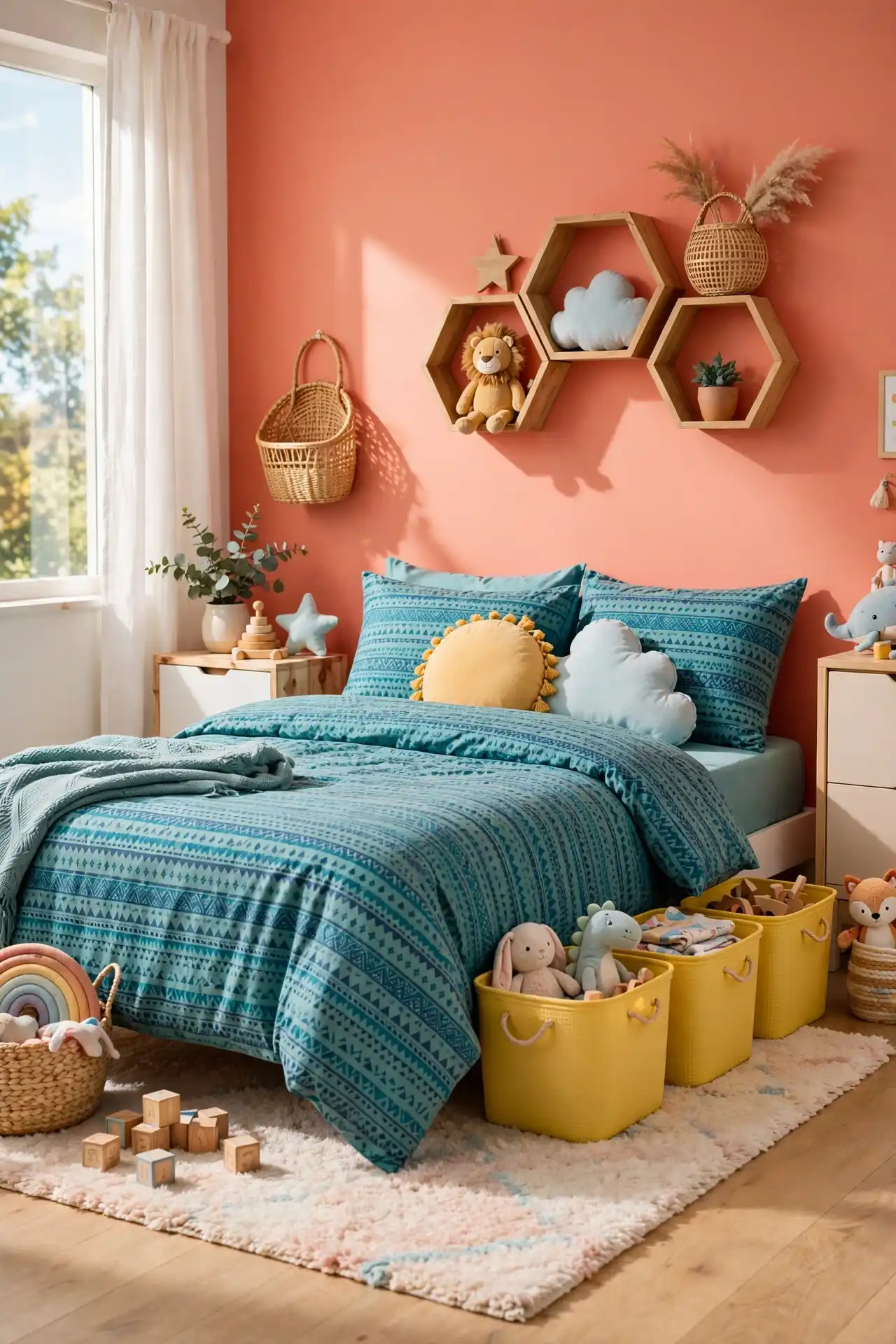
Kids’ rooms are one of the few spaces in the house where you can go genuinely bright without it feeling out of place, and this palette leans into that instead of fighting it.
Coral on one wall, teal in the bedding, and small bursts of sunshine yellow through storage bins or a rug create a room that feels playful without turning chaotic, which is the balance most parents struggle to find.
The key is picking one dominant color and letting the other two support it, rather than giving all three equal weight.
Coral as the anchor tends to age better with a growing child than teal or yellow would if used at full strength across every surface.
Swap out the smaller accessories, like bins or a lampshade, as your child’s taste changes, and keep the wall color as the one constant that doesn’t need to shift every few years.
A plain white room with a scattering of mismatched, generic toys and decor.
A coral accent wall grounds the room while teal and yellow add playful energy.
9. A Nursery Palette That Softens Sage, Sand, and Blush
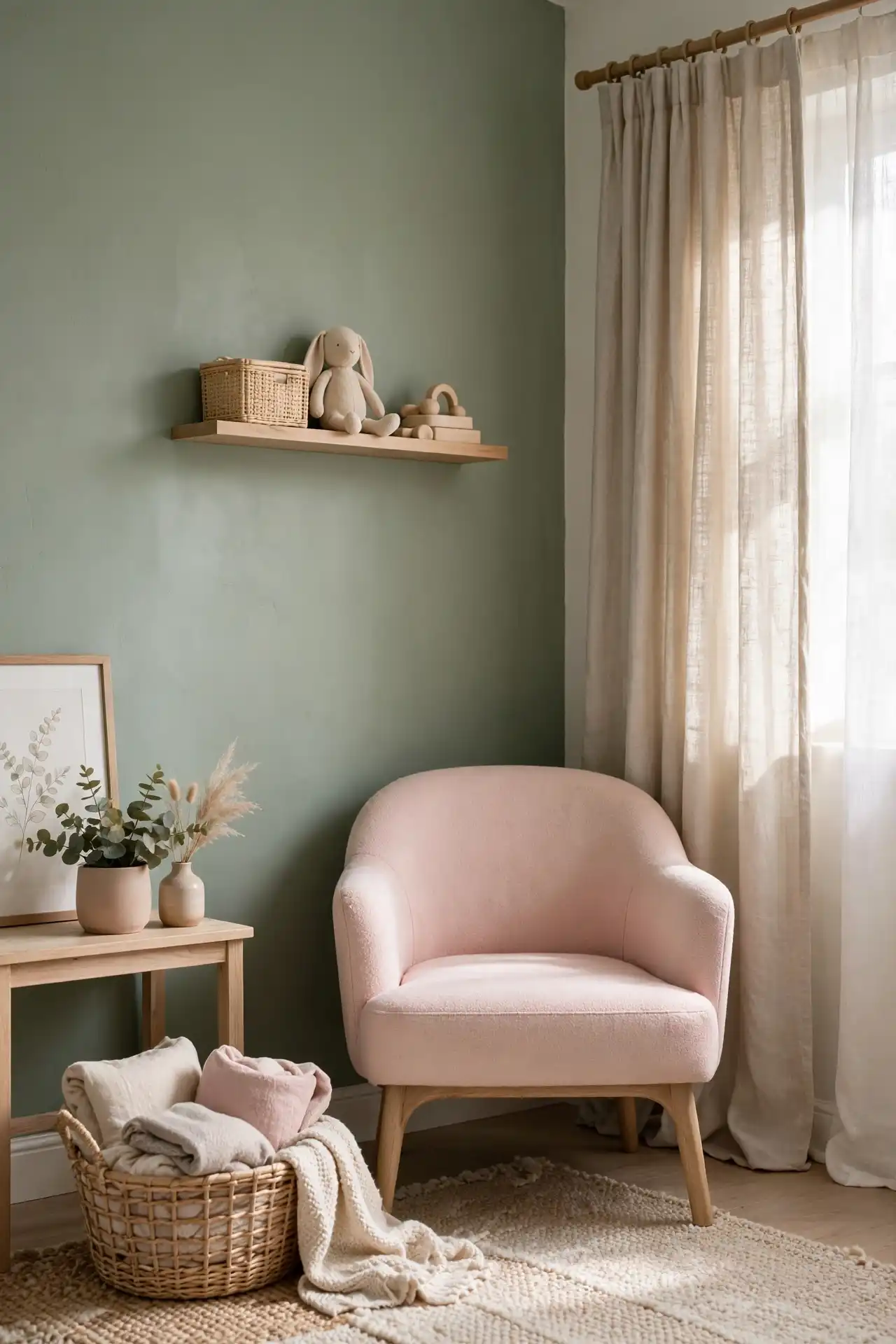
A nursery calls for a gentler version of the bolder palettes elsewhere in the house, since this is the one room meant purely for calm rather than making a statement.
Sage green walls, sand colored curtains, and a single blush accent, a chair or a small rug, create a space that feels grounded without leaning into the pastel sameness you see in most nursery inspiration photos.
What makes this combination work is that none of the three colors compete for attention.
Sage carries the most visual weight, sand fills in the quiet middle ground, and blush shows up only in small, deliberate touches rather than covering an entire wall or piece of furniture.
Avoid adding a fourth color even if you’re tempted, since this palette holds together specifically because it stays restrained.
📌 Good To Know
Sage green paint can shift gray or yellow depending on light. Test a swatch on the wall for a full day before committing to the full room.
10. A Reading Nook Palette Anchored in Deep Plum and Brass
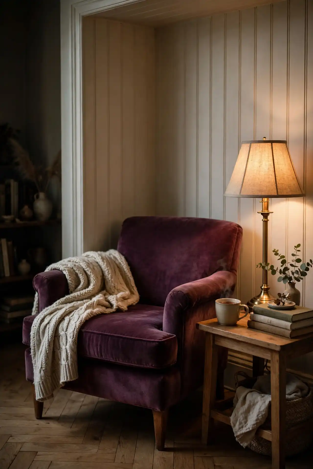
A reading nook works best when it feels like a small departure from the rest of the house, a spot that signals slow down the moment you sit in it.
Deep plum on a single wall or a large upholstered chair, paired with brass reading lamps and a side table, gives the space that separation without requiring its own room.
This palette leans richer than most of the others on this list, which is intentional.
A reading nook is usually a smaller footprint, a corner or an alcove, so it can handle a deeper, more saturated color than an open living room could without feeling cramped.
Pair the plum with a soft wool throw in a neutral tone so the space still feels inviting rather than overly formal.
11. A Guest Room Palette That Keeps Clay Neutral and Forest Green Balanced
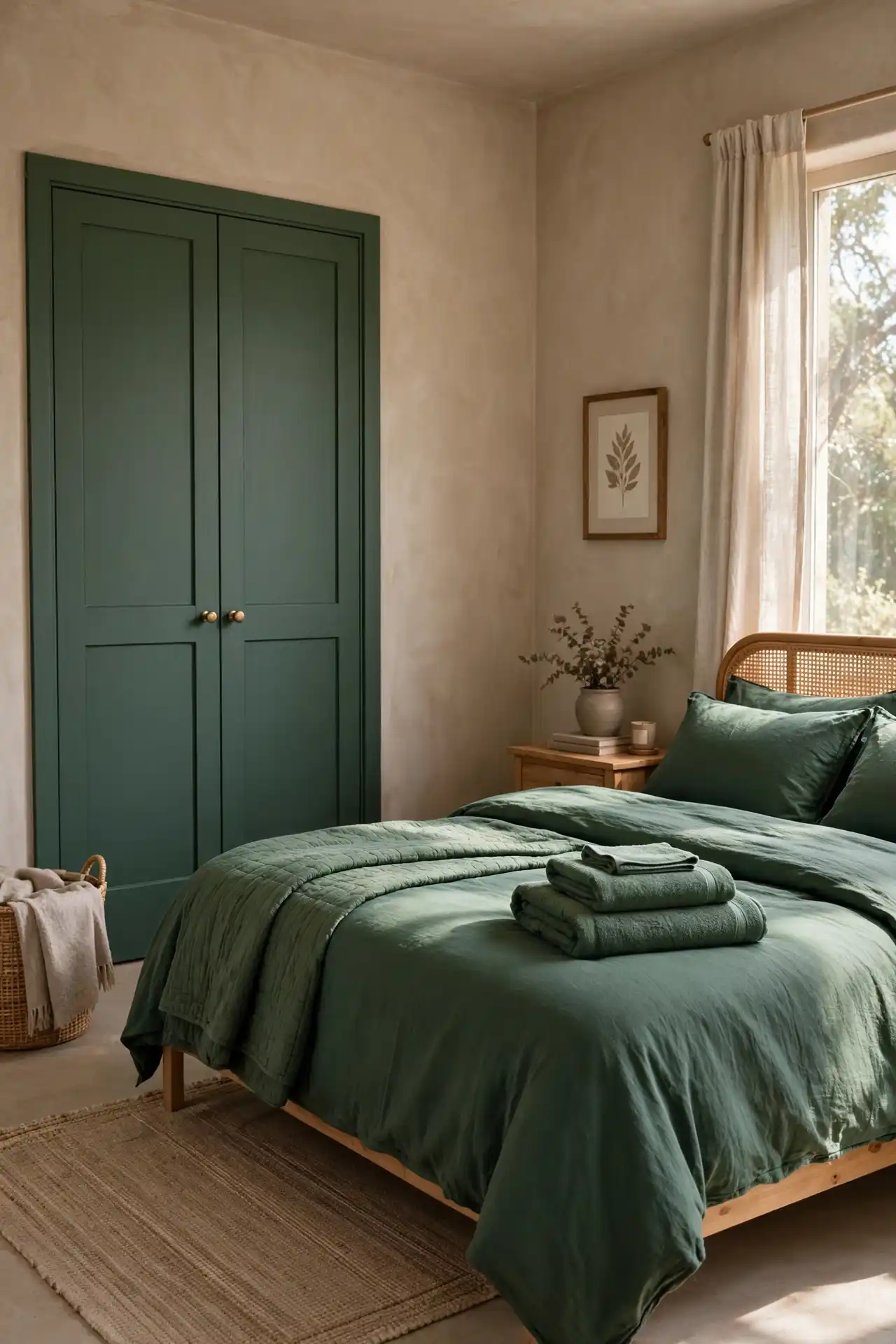
A guest room has a strange job, it needs to feel welcoming to someone who doesn’t live there, without borrowing so much personality from the rest of the house that it feels like storage with a bed pushed into the corner.
Clay neutral walls do the heavy lifting here, giving the room warmth without demanding attention, while forest green shows up through bedding or a single accent chair to keep things from feeling flat.
This combination works particularly well because clay neutral reads differently depending on the room’s light, sometimes pink, sometimes tan, which means it adapts to guest rooms with poor natural light just as easily as ones that get full sun.
Forest green is forgiving in the same way, since it doesn’t clash with whatever the guest brings in with them, luggage colors, clothing, anything temporary in the room.
Keep the closet and any built in storage in the same clay tone as the walls, so the room feels finished rather than pieced together at the last minute.
- Clay neutral walls adapt well to rooms with limited natural light.
- Forest green bedding adds depth without overwhelming a small footprint.
- Matching closet doors to the wall color keeps the room feeling complete.
12. A Sunroom Palette That Mixes Vibrant Orange, Turquoise, and White
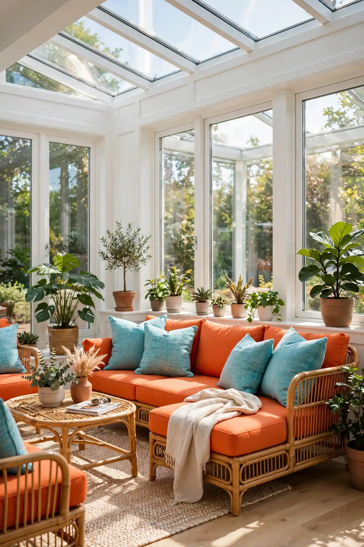
A sunroom gets more natural light than almost any other room in the house, which means it can handle color intensity that would feel like too much anywhere else.
Vibrant orange on outdoor style furniture, turquoise cushions, and white walls create a palette that leans into the light rather than fighting it, giving the space an energy that feels closer to a porch than a formal living room.
The white walls matter more than they seem to at first glance. Without them, the orange and turquoise combination can start to feel like a beach shop rather than a room in your home.
White resets the eye between the two bold colors and keeps the space from tipping into overwhelming.
This palette holds up especially well in sunrooms used seasonally, since the brightness matches how the room is meant to feel during the months it actually gets used.
13. A Basement or Media Room Palette in Charcoal, Gold, and Rust
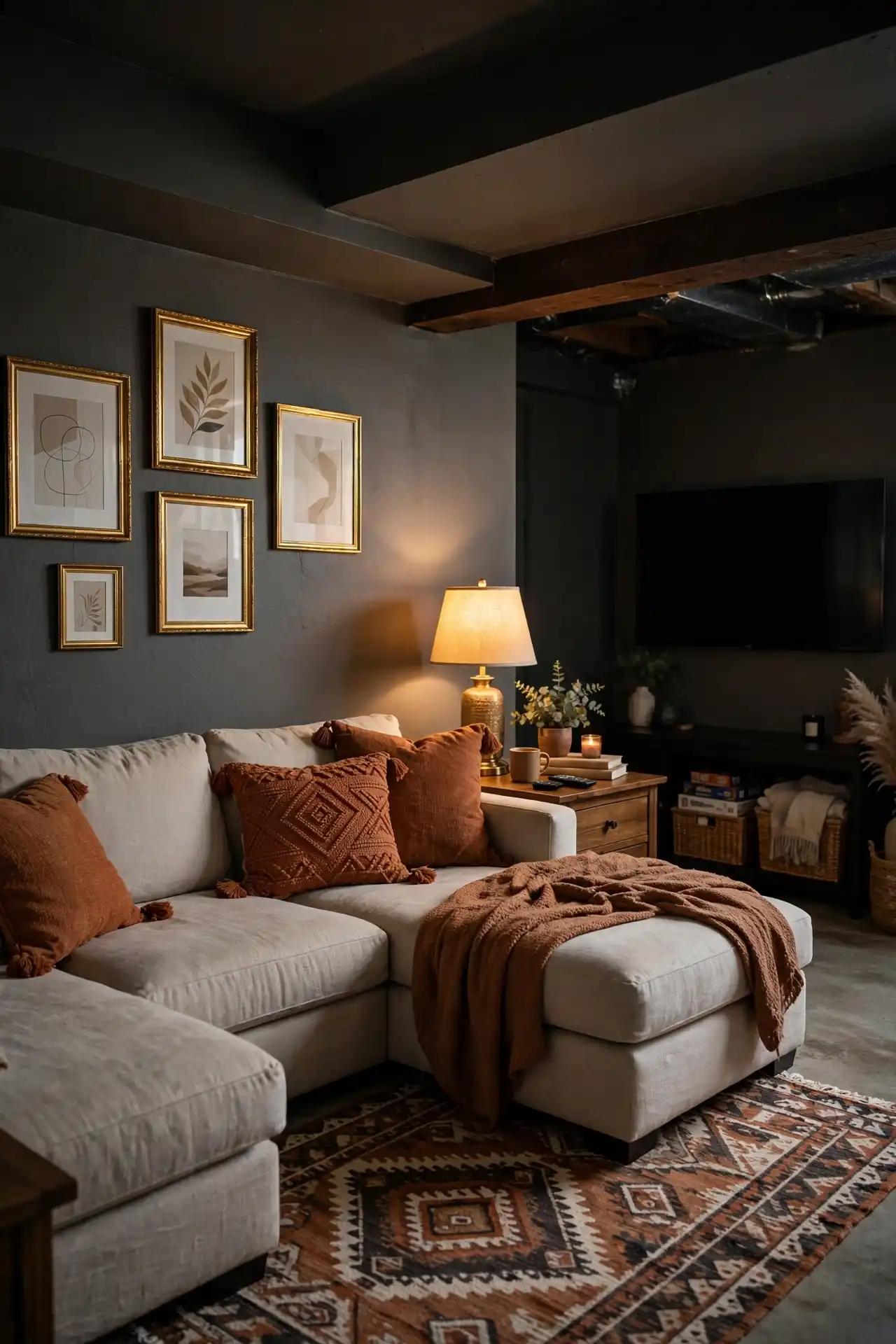
Basements and media rooms tend to fight low ceilings and limited light, which is exactly why most people default to painting them white and hoping for the best.
That approach usually backfires, since white without enough natural light to bounce off of just looks dingy instead of bright.
Charcoal walls actually solve this better, since they lean into the room’s dim nature rather than pretending it’s something it’s not, while gold hardware and rust upholstery keep the space from feeling like a cave.
Lighting becomes the real workhorse in this palette. Warm bulbs paired with a few well placed lamps do more here than they would in a sunlit room, since they’re compensating for what the space naturally lacks.
Rust throw pillows or a rug break up the charcoal without requiring a full second color on the walls.
Paint the main walls charcoal to work with the room’s natural dimness instead of against it.
Add gold through lamp bases, picture frames, or cabinet hardware.
Bring in rust through a rug or pillows to break up the charcoal.
14. A Patio Palette Built on Terracotta, Olive, and Warm White
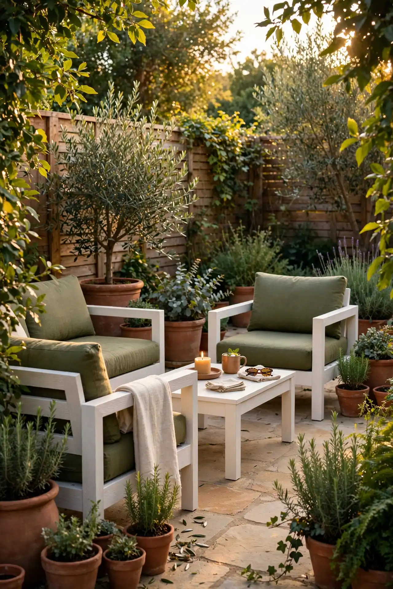
Outdoor spaces get treated as an afterthought more than any other part of the house, usually just whatever furniture was on sale that year with no real color plan behind it.
Terracotta planters, olive green cushions, and warm white furniture frames turn a patio into something that actually feels connected to the rest of your home’s palette instead of a mismatched extension of it.
This combination also happens to be practical, not just good looking. Terracotta and olive both hide dirt and weather wear better than lighter colors would, which matters outdoors more than almost anywhere else.
Warm white keeps the furniture from disappearing into the greenery around it, giving the whole setup a clear shape even from a distance.
Stick to weather resistant fabric in these tones rather than indoor textiles, since the palette only works if it can survive actually being outside.
Use terracotta planters as the anchor color outdoors.
Choose weather resistant olive fabric for cushions.
Bringing indoor fabric outside where it will fade fast.
Choosing a bright white that disappears into greenery.
Conclusion
Choosing Afrocentric color palette ideas for the home isn’t about picking one look and repeating it in every room.
What holds this list together is restraint, one or two bold colors doing the real work, with a neutral or two to keep them from overwhelming the space.
Some rooms call for deep, saturated tones, others need a softer touch, and knowing which is which comes down to how you actually use each space.
Start with the one room that’s bothered you the longest. Once you see how a considered palette changes it, the rest of the house gets easier to plan.
Save this list for the next time you’re standing in a paint aisle trying to remember which room needed what.