22 Afrocentric Wall Art Ideas That Instantly Anchor a Room


A living room can have the right sofa, the right rug, and still feel like it belongs to no one. That gap is usually the wall. Most people fill it with whatever is on sale at a big box store, then wonder why the room still feels borrowed instead of lived in.
Afrocentric wall art ideas for living room decor solve that problem in a different way. They are not about matching a trend board.
They are about putting up pieces that carry weight, texture, and a real point of view, so the wall stops being background and starts being the reason the room works.
This list is built for that. Twenty two ideas, each one different from the last, covering everything from a single carved mask to a full textile gallery wall.
Some take an afternoon. Some take one bold purchase. All of them give a plain wall a reason to be looked at twice.
22 Afrocentric Wall Art Ideas That Instantly Anchor a Room
1. Adinkra Symbol Panels That Turn a Blank Wall Into a Story

A blank wall behind a sofa does nothing for the room. It just sits there. Adinkra symbol panels change that fast because each symbol carries an actual meaning, so the wall stops being decoration and starts being something a guest will ask about.
Start with two or three symbols instead of ten. Too many at once turns into visual noise instead of a focal point.
- Pick symbols with meanings that fit the room’s purpose, like unity or wisdom
- Mount them at slightly different heights, not in a straight line
- Leave at least six inches of breathing room between each panel
Wood or metal panels hold up better over time than printed paper versions, especially if the wall gets afternoon sun.
2. Why a Mixed Textile Gallery Wall Beats a Matched Frame Set

Matched frame sets look tidy in a store display, but on an actual wall they can feel flat and a little cold.
A mixed textile gallery wall does the opposite. It layers a small woven piece next to a framed print next to a raw canvas panel, and that mix is what makes the eye stop moving and actually settle.
The trick is contrast in material, not just in image. Pair something soft and woven with something hard edged, like a metal accent or a carved frame.
💡 Quick Tip
Lay every piece on the floor first in the shape you want before hammering a single nail. It saves patching drywall later.
3. One Oversized Carved Mask as Your Room’s Anchor Point
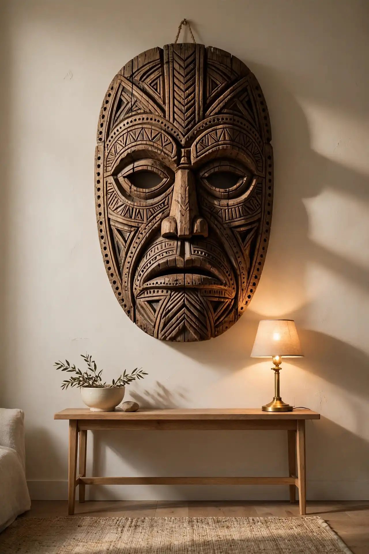
A room with too many small pieces scattered around can feel busy without ever feeling finished.
One oversized carved mask, hung alone above a console or sofa, solves that instantly because it gives the eye a single place to land.
Choose a mask with real depth to the carving, not a flat printed version. The shadow lines it casts under a lamp are part of what makes it work.
A wide, empty wall above the console that makes the whole room feel unfinished.
One carved mask fills the space and gives the room a clear focal point from the doorway.
4. Framing Mudcloth the Right Way So It Reads as Art, Not Fabric
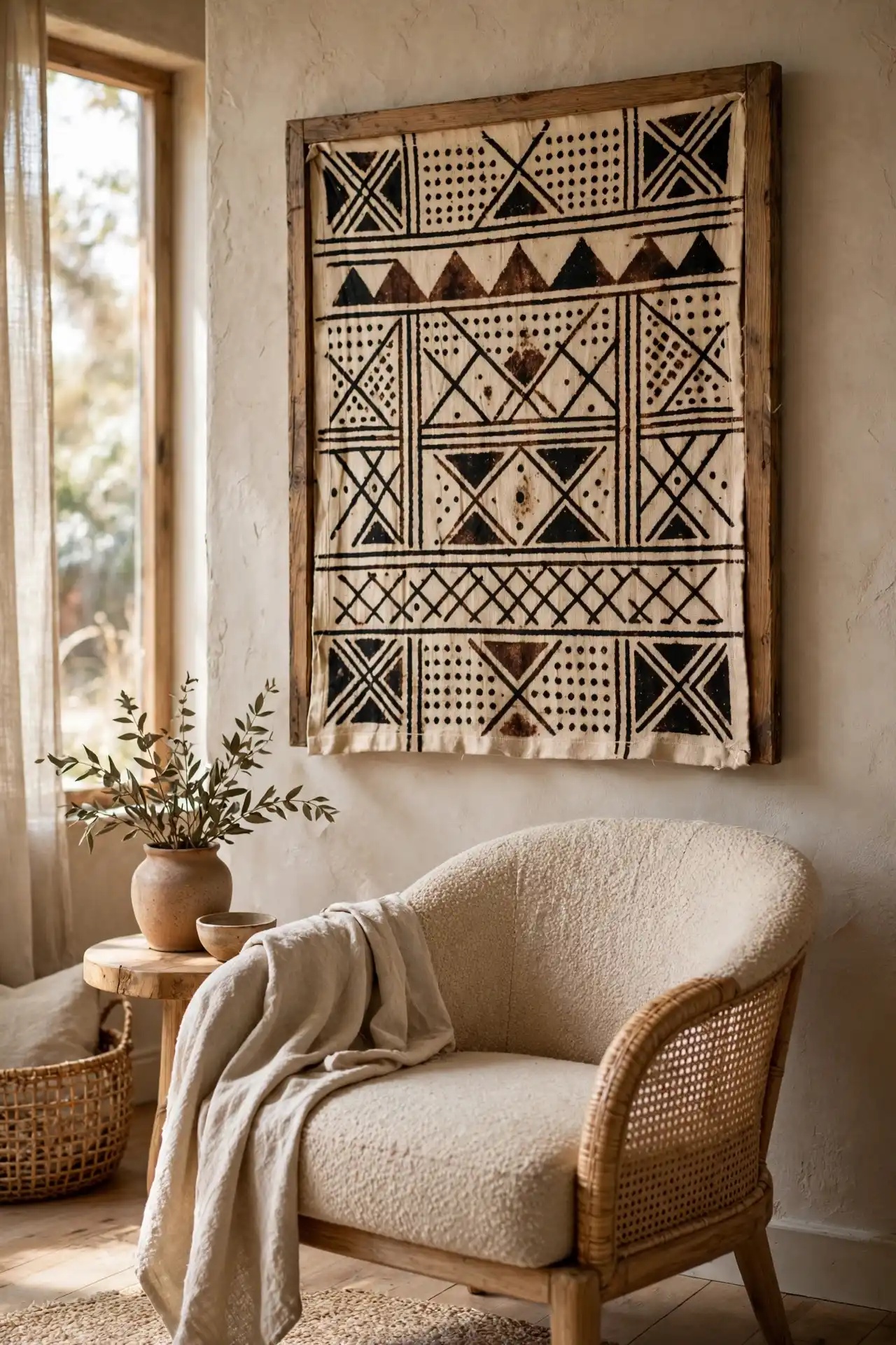
Mudcloth is easy to buy and easy to hang wrong. Pin it up loose and it reads as a throw someone forgot to fold. Frame it properly and it reads as a real piece of art.
Follow a simple process to get it right. A worn, uneven pattern is not a flaw here, it is what shows the piece was made by hand, so skip anything that looks machine perfect.
Stretch the fabric over a wood frame the way a canvas is stretched, keeping it taut and flat.
Skip glass. It flattens the texture that makes mudcloth worth hanging in the first place.
Hang it slightly off center over a chair or shelf instead of dead center over the sofa.
5. Portrait Art That Makes a Living Room Feel Personal
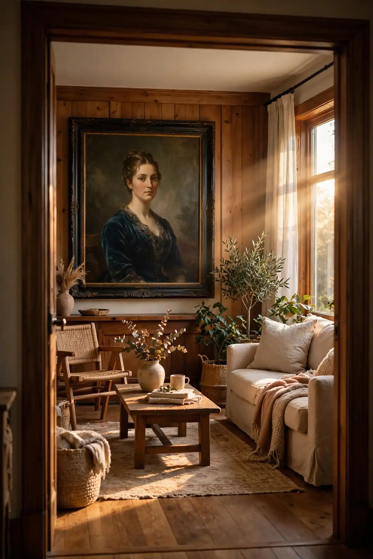
Landscape prints and abstract shapes are fine, but they rarely make a stranger stop and look. Portrait art does.
A strong painted or illustrated face, placed where it catches the eye from the entry, gives a room a sense of presence that pattern alone cannot.
Best for someone who wants the room to feel warm the moment guests walk in, not just visually balanced.
6. Styling a Woven Basket Wall Without It Looking Cluttered

A wall full of baskets can go two ways. Done well, it looks intentional and full of texture, the kind of wall that makes people slow down on their way to the kitchen.
Done poorly, it looks like storage that never made it into a closet, baskets scattered without any real logic behind where they landed.
The difference almost always comes down to planning before a single nail goes in the wall.
People tend to grab whatever basket is closest and hang it wherever there is space, and that guesswork is exactly what makes the wall feel messy instead of styled.
Before you hang a single basket
7. The Proverb Typography Mistake That Makes Wall Art Look Cheap
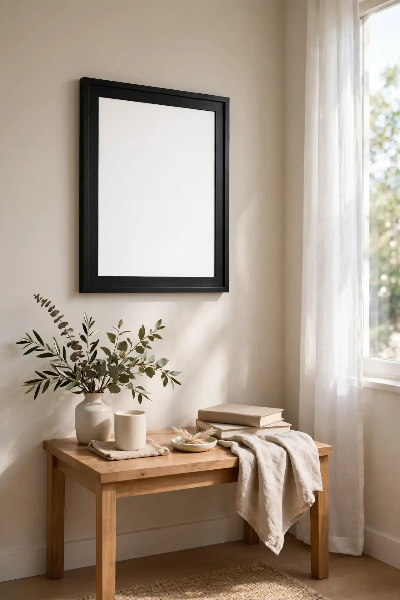
Word art sounds like an easy win. Print a proverb, drop it into a frame, hang it up, done.
Except the wrong font choice can quietly undo the whole thing, turning a phrase that actually means something into art that looks like it came off a discount store shelf.
Thin script fonts on a busy patterned background are the most common trap people fall into.
They are hard to read from across the room, they lose their shape at a distance, and they end up fighting with the wall behind them instead of standing apart from it.
Choose a bold, solid weight font with real contrast against the frame.
Keep the background plain so the words carry the weight.
Thin cursive fonts that blur at a normal viewing distance.
Busy patterned backgrounds behind the text.
8. Cowrie Shell Wall Art vs. Beaded Wall Hangings: Which Fits Your Space
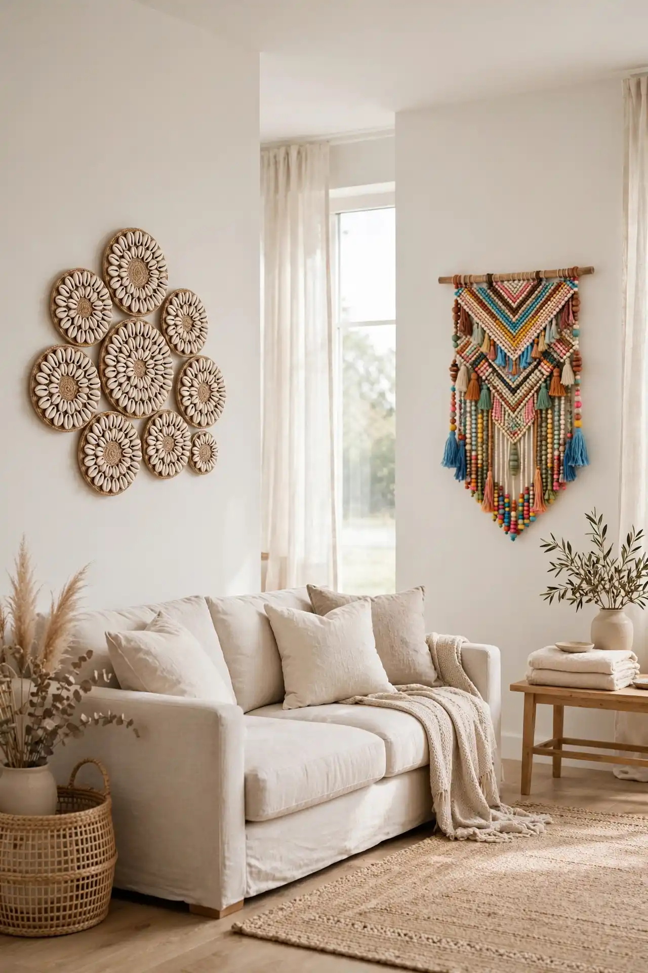
Both pieces bring real texture and history to a wall, but they do not suit the same kind of room, and picking between them mostly comes down to what the rest of the space is already doing.
Shell art leans coastal and neutral, staying quiet enough to sit behind almost any furniture. Beaded hangings bring color in fast, sometimes more of it than a small room can comfortably hold.
Here is how the two actually compare side by side, since the difference matters more than it might seem at first glance.
| Cowrie Shell Art | Beaded Hangings |
|---|---|
| Neutral tone, works with almost any wall color | Bright color, needs a calmer wall to balance it |
| Best in smaller clusters, 3 to 5 pieces | Works well as one strong statement piece |
| Reads as coastal or earthy | Reads as bold and folk inspired |
9. Why Batik Panels Work Where Canvas Prints Fall Flat
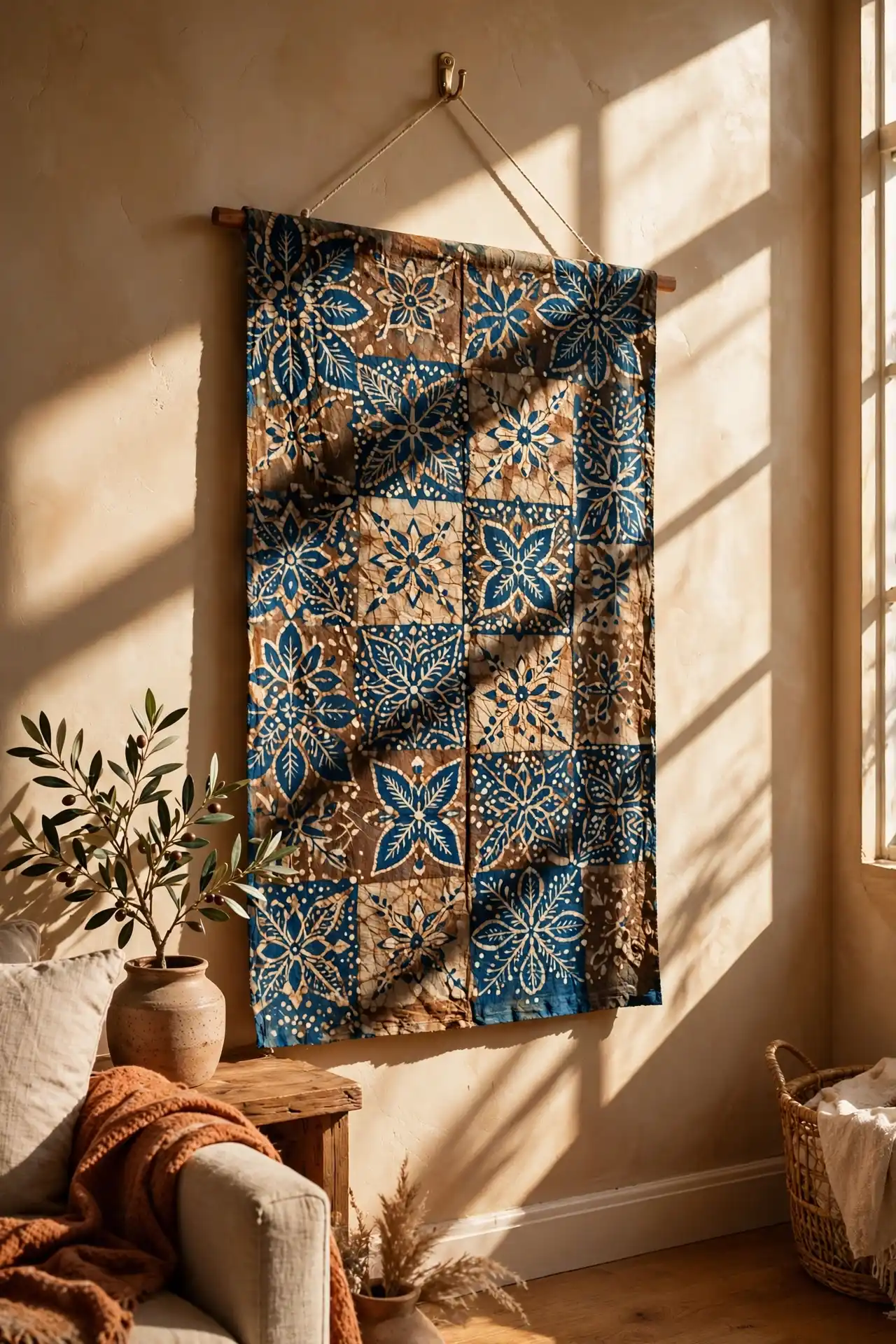
Canvas prints are everywhere, in every price range, in every home goods store. They are the safe choice, and that convenience is exactly the problem.
Batik panels carry a hand dyed irregularity that a mass printed canvas simply cannot fake, and that small imperfection is often the exact detail that catches someone’s eye on the way past a doorway.
A hand dyed batik panel will never look exactly like the one next to it, and that is the whole point.
10. Hanging a Carved Wood Sculpture So It Doesn’t Look Like an Afterthought

A wall mounted wood sculpture gets pushed into a corner more often than it should, almost like an apology for taking up space it deserves to have.
Give it real room instead. A carved piece needs clearance on all sides to actually read as art, rather than getting lost as clutter next to a bookshelf or lamp.
📌 Good To Know
Leave at least 12 inches of clear wall around a sculptural piece so its shadow and shape have room to stand out.
11. Building a Height-Varied Cluster With Small Adinkra Pieces
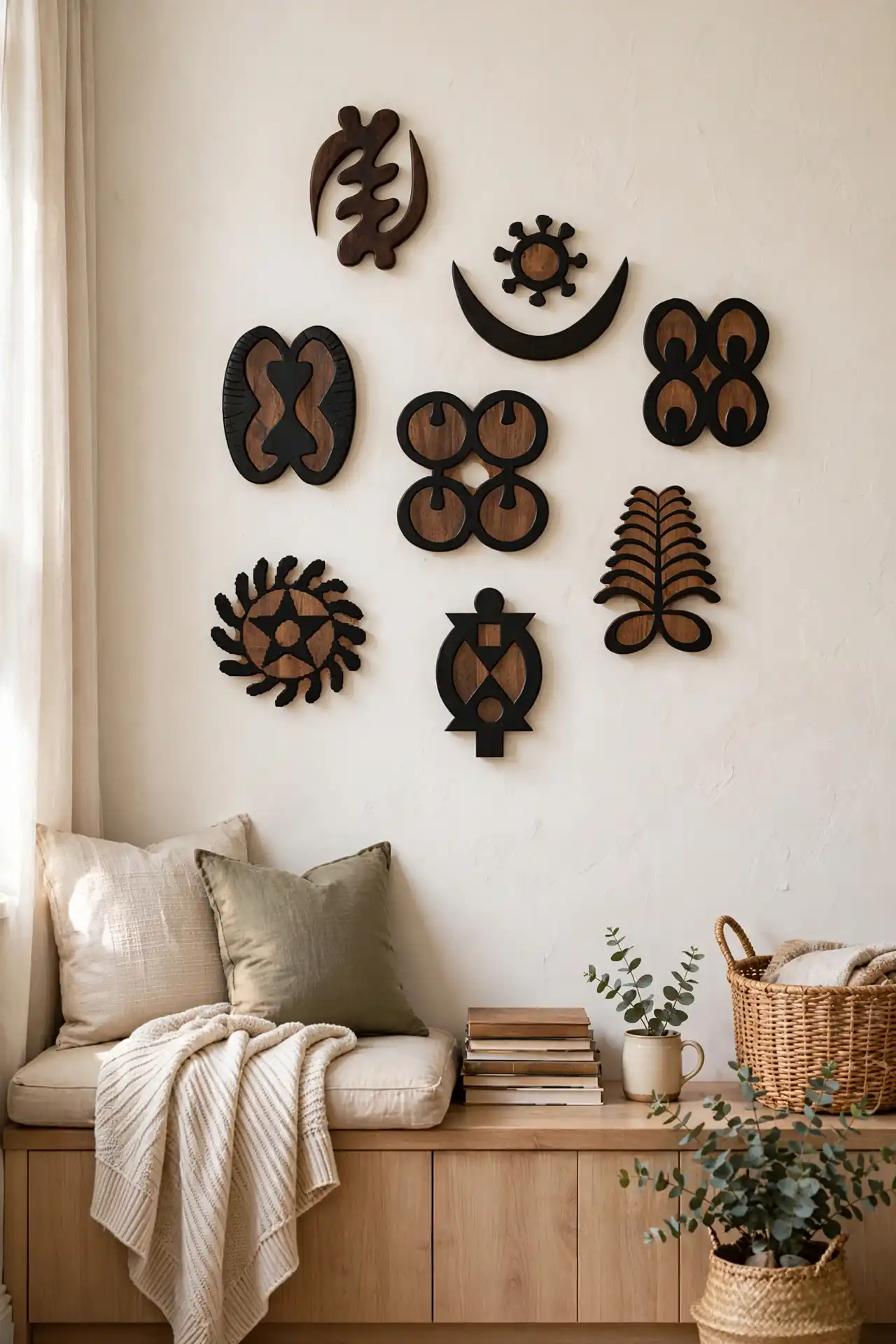
Small pieces get overlooked more than they should, mostly because people try to hang them in one flat row like a shelf display.
That approach almost always looks like an afterthought instead of a real design choice.
A height-varied cluster changes that completely, turning a handful of small carved or metal Adinkra pieces into something that reads as one connected composition rather than scattered leftovers.
The trick is treating the empty wall space between pieces as part of the design, not just gaps to fill in later.
Some pieces should sit close together, almost touching, while others need real breathing room to stand out on their own.
12. Vintage African Map and Travel Art for a Collected-Over-Time Look

A room full of brand new pieces, no matter how well chosen, can still feel like it was decorated in a single weekend.
Vintage maps and old travel prints break that pattern immediately, because they carry a sense of history that nothing bought last month can fake, even if the newer piece is technically better made.
Look for maps with visible age, foxing on the paper, slightly faded ink, a fold crease or two.
These are not flaws to hide behind glass, they are what makes the piece feel collected rather than purchased.
Look for estate sales, secondhand shops, and online sellers who specialize in antique paper goods.
Frame with a simple mat and thin dark wood so the map’s own color stays the focus.
Group two or three maps of different regions instead of hanging just one alone.
13. Kuba Cloth Tapestries: The Before and After of an Empty Wall
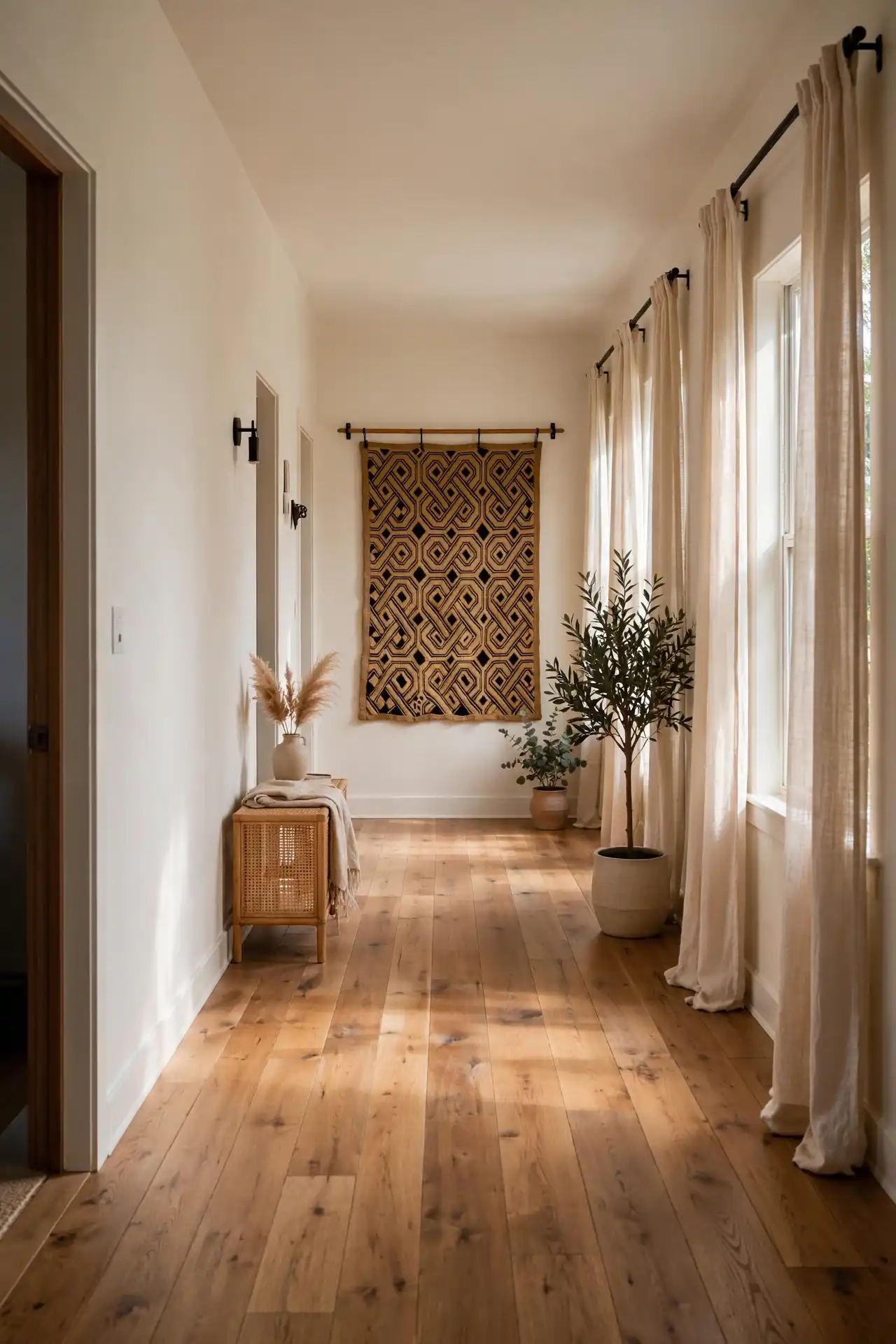
An empty stretch of wall in a hallway or above a headboard tends to sit unresolved for months, mostly because nothing feels big enough to fill it properly.
A Kuba cloth tapestry solves that in one move, bringing in geometric pattern and raffia texture that a flat print could never match.
Hang it the way it was traditionally displayed, flat against the wall with simple mounting rods rather than a frame.
A frame flattens the raffia texture that makes the piece worth hanging, and can make a handmade textile look like a printed reproduction instead of the real thing.
Give it space around it too, since a Kuba cloth piece carries enough visual weight on its own without smaller frames crowding it.
A long, plain hallway wall that guests pass without ever noticing.
The tapestry’s raised pattern catches light and slows people down as they walk past.
14. Three Things to Check Before You Buy Black-Owned Abstract Prints
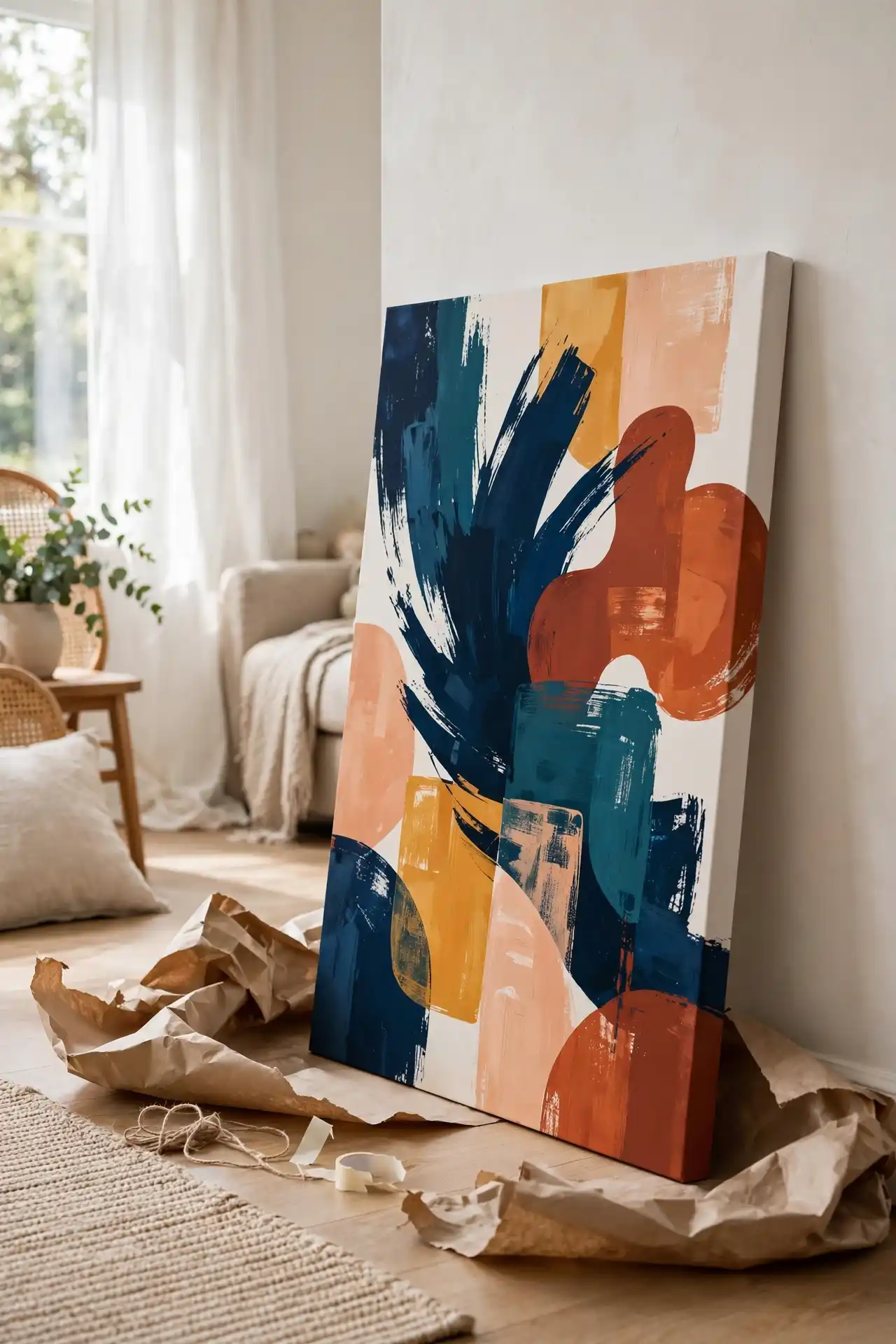
Supporting Black-owned art shops feels good, and it should, but that intention alone does not guarantee the piece will actually work in the room.
A few practical checks before checkout save both money and a return shipping headache later.
Check the print’s actual dimensions against the wall space, not just how it looks in a listing photo.
Ask whether it ships framed or unframed, since framing costs can quietly double the total price.
Look at the color tones across more than one photo too, since lighting can shift a print’s true shade more than people expect.
A small independent shop may take longer to ship than a big retailer, so build that extra time into any plans around a specific deadline.
- ✓ Check actual dimensions against your wall space — don’t rely solely on listing photo proportions.
- ✓ Confirm framing status before buying, as framing costs can easily double your total price.
- ✓ Compare color tones across multiple photos, since lighting variations can shift the print’s true shade.
15. Pairing a Round Mirror With Tribal Pattern Art for Balance
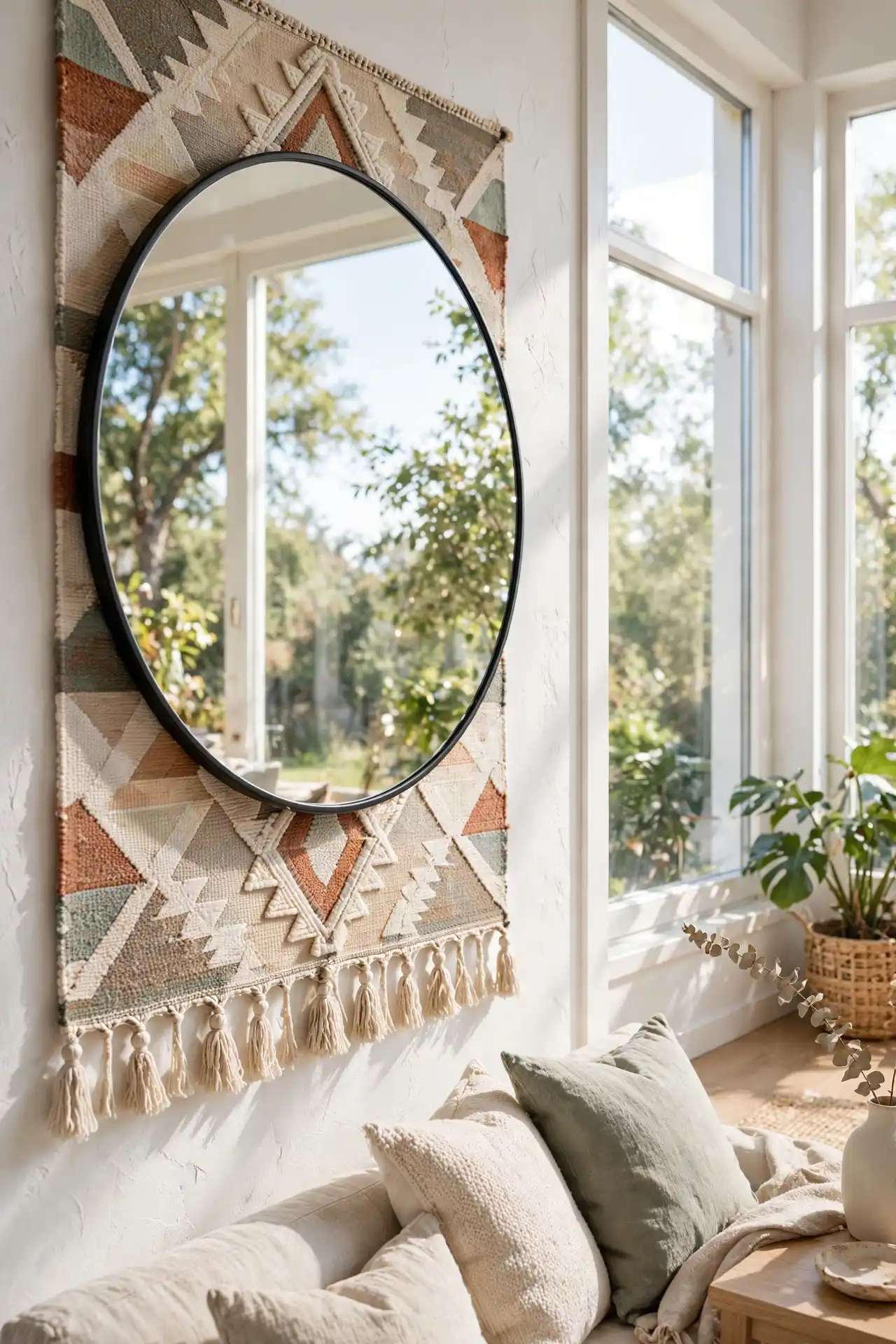
Sharp geometric patterns can start to feel heavy on a wall, especially in a smaller room where every angle competes for attention.
A round mirror placed next to or slightly overlapping a patterned piece breaks up those hard lines and gives the eye a place to rest.
Keep the mirror a step smaller than the patterned piece next to it, otherwise it starts pulling focus away instead of softening the arrangement.
Angled slightly toward a window, it also bounces natural light back across the pattern, making the whole grouping feel brighter without adding a single extra light fixture to the room.
16. A Woven Raffia Wall Hanging for Texture Without Heavy Color
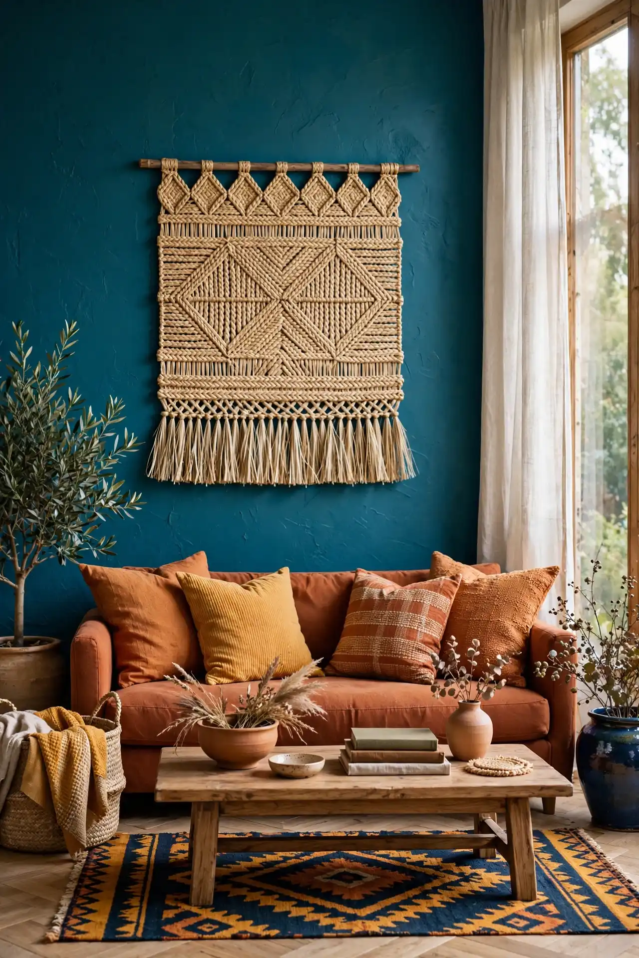
Not every wall needs more color. Some rooms already have a lot going on between the rug, the throw pillows, and a bold sofa, and adding a bright piece of art on top of that just makes everything compete.
A woven raffia wall hanging solves that problem by bringing in real texture and natural warmth without adding a single new color to the mix.
The material itself does the visual work. Raised fibers catch shadow differently depending on the time of day, so the piece never looks completely flat even though it stays neutral in tone.
💡 Quick Tip
Hang it in a room that already has a strong color story, letting the raffia calm things down instead of adding to the noise.
17. Layering Family Photos Inside an Afrocentric Frame Set

A gallery wall of family photos can start to feel generic once the frames all come from the same big box store set.
Swapping in carved wood or beaded frame details keeps the personal story of the photos intact while giving the arrangement a distinct point of view.
Mix two or three frame styles that share a wood tone or metal finish rather than matching every frame exactly, since that shared thread keeps the wall feeling intentional.
Converting older photos to black and white also helps when the collection spans several decades. Leave one or two frames empty on purpose, ready for whatever photo comes next.
Mix two or three frame styles that share a wood tone or metal finish.
Convert older photos to black and white so mismatched color casts do not clash.
Five or more completely different frame finishes in one cluster.
Hanging every frame at the exact same height.
18. Choosing Between Metal Wall Sculptures and Wood Carvings

Both bring a strong three dimensional presence to a wall, but they read very differently depending on the rest of the room’s finishes.
Metal pulls toward something modern and cooler in tone. Wood pulls toward something warmer and more grounded, closer to furniture than to sculpture.
If the room leans toward clean lines and minimal furniture, metal keeps that mood intact. If the room already has a lot of natural wood, a carving simply continues that material story.
Weight matters too, wood carvings tend to be heavier and need a sturdier wall anchor than metal pieces.
| Metal Sculpture | Wood Carving |
|---|---|
| Cooler tone, pairs with modern furniture | Warmer tone, pairs with natural materials |
| Lighter weight, easier to hang | Heavier, needs a sturdier wall anchor |
19. Why an Oversized Single Print Can Beat a Busy Gallery Wall
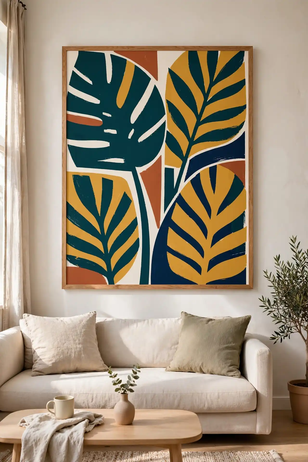
A gallery wall takes planning, patience, and usually a few patched nail holes before it looks right.
An oversized single print skips all of that. One large, well chosen piece can carry the same visual weight as a dozen smaller ones, with a fraction of the effort.
Sizing matters most here. A print sized to fill roughly two thirds of the furniture beneath it tends to read as intentional and finished rather than undersized.
This approach also works well for renters or anyone who moves often, since one piece is far easier to pack and rehang than a full gallery wall.
One large print, sized to fill roughly two thirds of the furniture beneath it, almost always reads as more finished than five small ones combined.
20. Hanging Ankara Print Art in a Hallway So It Guides the Eye

Hallways get skipped over constantly, treated as empty pass-through space instead of an actual part of the home worth decorating.
Ankara print art, with its bold repeating pattern, works well here because the eye naturally follows a strong pattern down a narrow space.
Measure the full hallway length before choosing print sizes and spacing, since uneven gaps are far more noticeable in a narrow space.
Hang at a slightly lower height too, since hallways are viewed while walking, not sitting.
Repeating the same fabric pattern across several small frames keeps the hallway feeling cohesive instead of cluttered.
Before you plan the hallway layout
21. A Small Shelf Ledge for Rotating Art Instead of Nailing Everything Down
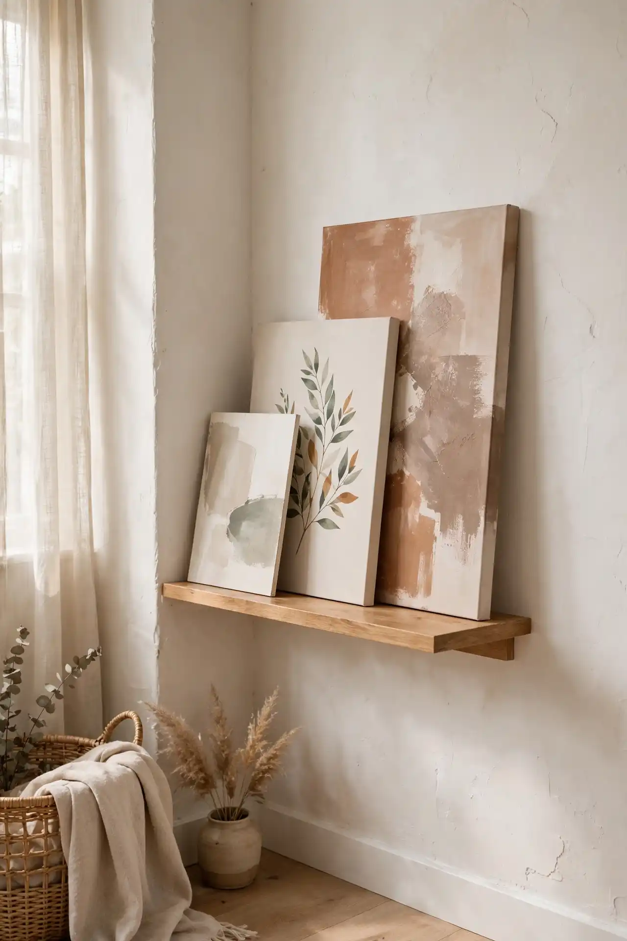
Committing to a single fixed piece of art on a permanent wall can feel like a big decision, especially in a room that changes with the seasons.
A small floating shelf ledge solves that pressure entirely, letting art lean and rest instead of being nailed into place for good.
Lean two or three pieces of varying height against the wall, slightly overlapping the front edges, so the arrangement has some visual depth.
It also solves a smaller problem, giving new art somewhere to live immediately instead of leaning against a closet wall for months while a final decision gets put off.
One fixed piece has hung in the same spot for two years, never changed.
A ledge lets three pieces rotate through the season, refreshed in minutes instead of a full afternoon.
22. Finishing the Room With One Bold Color-Block Abstract Piece
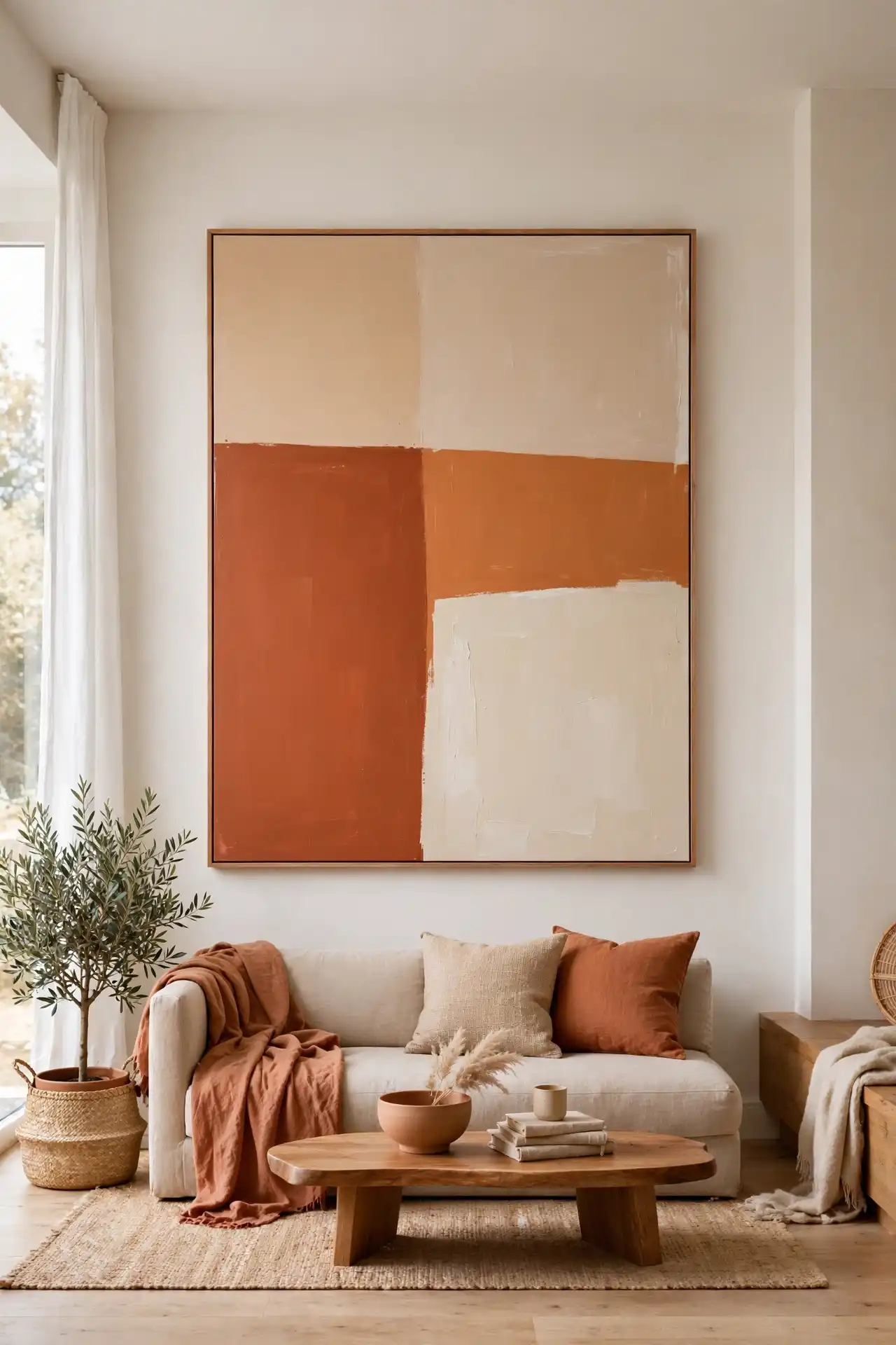
Every room in this list eventually needs a stopping point, one final piece that pulls the whole wall together instead of just adding one more item to the mix.
A bold color-block abstract does exactly that, working as a closing statement rather than another addition competing for attention.
Pull one color directly from the room’s existing palette so the piece feels connected instead of random.
Give it its own wall, away from smaller pieces, since a bold abstract surrounded by other art tends to get visually diluted. Treat it as the last decision in the room, not the first.
Pull one color directly from the room’s existing palette so the piece feels connected, not random.
Hang it as the last piece added, once every other wall decision has already been made.
Give it its own wall, away from smaller pieces, so it can stand as a single focal statement.
Conclusion
A wall does not need every idea on this list. It needs one or two that actually fit the room, chosen with the same care as the furniture already sitting in it.
Whether that means one oversized carved mask above the sofa or a full gallery wall built from mixed textiles, the goal stays the same: a wall that says something about the people living underneath it.
These Afrocentric wall art ideas for living room spaces work because they carry real texture, real history, and real craftsmanship, the kind that a mass produced print can never quite match.
Save this list for the next time a blank wall needs a plan instead of a guess.